"You have such nice writing tools, and how many pencils you have, how many feathers, what a dense, glorious paper ... And what a glorious office you have!"
F.M. Dostoevsky, The Idiot
First they used hand-written fonts. They were used by skilful scribes, calligraphers, because of the laboriousness of making manuscripts that turned everyone into a work of art.
With the invention of printing, the art of calligraphy is a thing of the past. It became unnecessary to display every manuscript squiggle, it was required to have standard pre-prepared letters in a certain sequence. This involved professional typographers. Readers received a ready-made standardized product, and themselves continued to write letters or compose manuscripts manually, due to the fact that there were no suitable for individual work of printing houses.
The situation shifted from a dead center with the invention of typewriters. About happiness: a mechanized letter has become available to everyone! From the clerical workers they began to demand the ability to print on a typewriter instead of a beautiful handwriting - however, the manuscript could be handed over to the typewritten office, where experienced typists turned any business paper written in the most clumsy handwriting into a legible document. With the proliferation of typewriters, the individuality of the handwriting, along with that the slightest variety in lettering, faded into the past: if you could replace one type of cash register for another with a typographical set, then you could not change the font on a typewriter - technically unjustified.
A new round of technical progress in the field of typewriting techniques - the invention of computers - returned the individuality of handwriting to its former greatness. Fonts remained standard, but now they were chosen according to their own taste and discretion.
Desirable mechanization with preservation of individual characteristics? Certainly so. But let's compare all of us familiar computer fonts with handwritten ones: partly with a cognitive purpose, in part - with the aim of indulging in nostalgia for the great and unforgettable art of calligraphy that has left behind.
"Mom washed frame" - it's all remember, take something as simple, with this age.
This is from the 1837 list. Pushkin did not have time to learn from them, but it was unlikely that the specimens of his time were anything fundamentally different. School recipe - a little more in them ornate or a little less - and there are school prescriptions: it is difficult to bring out the right scribble with your hand, but in the end their monotony becomes boring.
What is this science, in fact, in which the main thing - to keep the right slope?

As instructed by the main character of the famous novel by V. Kaverin "Two Captains" an unloved stepfather: the rods must be perpendicular.
Also it is necessary to observe a monotonous indenting of words from each other.

Plus the harmonious thickness of the lines, achieved by the inclination of the pen and the pressure on the paper.

And of course, the overall smoothness of the inscriptions pleasant to the eye.


To comply with the rules, it was necessary to properly hold the pen in the fingers - the main production tool of the calligrapher ...


... and maintain proper posture.

To learn how to write down - how to teach any other craft - it took years of hard work: in schools, business colleges, calligraphy courses, very common at the beginning of the last century.

But if a person has mastered this art, - oh! he became a guru, to whom any professional grace is available. First of all handwriting - speaking computer language, fonts. Here, thanks to the individuality of the master, there was no limit to perfection. Look at these samples of lettering, from relatively simple to the most intricate, and appreciate their ageless beauty.


From such handwriting to painting - one step. Why would a man who has mastered such intricate traits not manifest himself in an adjacent area? And they showed.
Calligraphers painted in their close style painted calligraphic drawings, often with applied purposes or simply for pleasure.


Naturally, this is how the girls who were not studying were drawn, and people of age, wise with the experience - as the masters of their business.

On this, in fact, it would be possible to finish, but I want to give a short excerpt from the novel "Idiot", from which the epigraph is borrowed to this post.
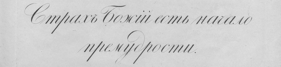
"- Wow! - cried the general, looking at the sample of calligraphy, presented by the prince: - but this is a recipe! Yes, and a rare inscription! Look, Ganya, what a talent!
On a thick vellum sheet the prince wrote a medieval Russian font:
"The humble hegumen Paphnuti put his hand."
"This," explained the prince with extreme pleasure and animation, "is the signature of the hegumen Pafnutia from the photograph of the fourteenth century." They superbly signed, all these our old hegumens and metropolitans, and with what sometimes taste, with what diligence! Do not you have at least a Pogodin edition, General? Then I wrote here in a different font: it was a round, large French font of the last century, other letters were even written differently, the font was square, the font of public scribes borrowed from their samples (I had one) - you will agree that it is not without merits. Take a look at these round d, as well. I translated the French character into Russian letters, which is very difficult, but it turned out well. Here is another fine and original font, here is this phrase: "zealousness prevails." This is a Russian script, or, if you like, a military Writer's. So the official paper is written to an important person, also a round font, glorious, black font, black written, but with a wonderful taste. The calligrapher would not have allowed these strokes or, better to say, these attempts to be struck out, these unfinished half-twins, - notice, - but in general, look, it is in fact a character, and, really, the military-writer's soul all over looked here: I wanted to, and I asked for talent, and the military collar was tightened tightly onto the hooks, discipline went out in the handwriting, lovely! It recently recently struck me one such example, I accidentally found it, and where else? in Switzerland! Well, behold, this is a simple, ordinary and purest English typeface: beyond that grace can not go, everything is delicious, beads, pearls; it's over; but here's the variation, and again the French, I borrowed it from a French traveling commies: the same English font, but black; the line is a bit darker and thicker than in English, en is the proportion of light and is broken; and notice also: the oval is changed, the rosette is rounder and in addition the stroke is allowed, and the stroke is the most dangerous thing! Roscher requires an unusual taste; but if he succeeded, if only a proportion is found, then such a font can not be compared with anything, so even that you can fall in love with it.
- Wow! Yes, what are you going to do with the subtlety, "laughed the general," but you, my father, are not just a calligrapher, are you an artist, are you? "
Now do you understand what kind of intricate art Prince Myshkin owned? Is it possible for such a deep individualization when using computer fonts?
There is very little factual information about the time, conditions and origin of the Slavic letter. The opinions of scientists on this issue are contradictory.
In the middle of the 1st millennium BC. e. The Slavs inhabited huge territories in Central, Southern and Eastern Europe. Their neighbors in the south were Greece, Italy, Byzantium - a kind of cultural standards of human civilization.
Young Slavic "barbarians" constantly violated the borders of southern neighbors. To curb them, Rome and Byzantium decided to convert the "barbarians" into the Christian faith, subordinating their principal churches - Latin in Rome, Greek in Constantinople. The "barbarians" began to send missionaries. The envoys of the church, sincerely and confidently fulfilled their spiritual duty, and the Slavs themselves, living in close contact with the European medieval world, were increasingly inclined to the need to enter the bosom of the Christian church, and at the beginning of the IX century began to accept Christianity.
But, how to make sacred writings, prayers, messages of the apostles, writings of the Church Fathers accessible to converts? The Slavonic language, differing in dialects, remained unified for a long time, but the Slavs did not yet have their own written language. "Before the Slavs, when they were pagans, did not have written letters," says the Tale of the Churbrist "On the Writings," but [they thought] and guessed with the help of features and cuts. " However, when trading transactions, taking account of the economy or when it was necessary to accurately convey a message, and even more so when dealing with the old world, it is unlikely that the "features and cuts" were enough. There was a need to create a Slavic script.


The letter "features and rezov" - Slavic runes - a writing that existed, in the opinion of some researchers from the ancient Slavs to the baptism of Rus. Runes were used as a rule for short inscriptions on gravestones, on border marks, on weapons, ornaments, coins and very rarely on canvas or parchment. "When [the Slavs] were baptized," said the blackbird Hrabr, "they tried to write the Slavic speech with Roman [Latin] and Greek letters without order." These experiences have partially come down to our days: they sounded Slavic, but written in the 10th century in Latin letters, the main prayers spread among the Western Slavs. There are also other interesting monuments - documents in which Greek letters contain Bulgarian texts, and those times when the Bulgarians spoke still in the Turkic language (later Bulgarians will speak Slavic).
And yet neither the Latin nor the Greek alphabet matched the sound palette of the Slavonic language. The words, the sound of which can not be correctly conveyed in Greek or Latin letters, was already quoted by the black-haired Khrabr: belly, cirkli, aspiration, youth, language and others. In addition, the other side of the problem was revealed - political. The Latin missionaries did not seek to make the new faith understandable to the Slavic believers. In the Church of Rome, it was widely believed that there were "only three languages in which it is fitting to praise God with the help of (special) writings: Jewish, Greek and Latin." Rome firmly adhered to the position that the "mystery" of the Christian teaching should be known only to the clergy, and simple very few very specially processed texts - the rudiments of Christian knowledge - are enough for simple Christians.
In Byzantium, it was looked at, somewhat differently, and began to think about the creation of the Slavic alphabet. "My grandfather, and my father, and many others have been looking for them and have not found," says Emperor Michael III, the future creator of the Slavic alphabet, Constantine the Philosopher. It was Constantine the Philosopher who called him, when in the beginning of the 860s an embassy of Slavs from Moravia (part of the territory of modern Czechia) came to Constantinople. The tops of the Moravian society adopted Christianity three decades ago, but among them the Church of the Germans was active. Apparently, trying to gain complete independence, the Moravian prince Rostislav asked "the teacher, that they should set forth our right faith in our language ...", i.e. create their own alphabet for them.
"No one can accomplish this, only you," said Caesar Constantine the Philosopher. This difficult, honorable mission lay simultaneously on the shoulders of his brother, hegumen (abbot) of the Orthodox monastery - Methodius. "You are in fact Solune, and the Solunians all speak the Slavonic language purely," - the Emperor added another argument.
Constantine (in the tonsure of Cyril) and Methodius (his secular name is unknown) are two brothers who stood at the origins of the Slavonic writing. They came from the Greek city of Solun (modern its name - Thessaloniki) in the north of Greece. In the neighborhood lived the southern Slavs, and for the inhabitants of Solun, the Slavonic language, apparently, became the second language of communication.
Constantine and his brother were born in a large rich family, where there were seven children. She belonged to an important Greek family: the head of the family named Leo was considered an important person in the city. Constantine was the youngest. Another seven-year-old child (as described by his "Life"), he saw a "prophetic dream": he had to choose from all the girls in the city to choose his wife. And he pointed to the most beautiful: "Her name was Sophia, that is, Wisdom." Phenomenal memory and unique abilities of the boy amazed others.
Having learned about the special talent of the children of the Solun nobleman, the ruler of the Caesar called them to Constantinople. Here they received a brilliant education at that time. Knowledge and wisdom Constantine earned himself honor, respect and a nickname - "Philosopher". He was famous for many of his verbal victories: in discussions with the carriers of heresies, on the debate in Khazaria, where he defended the Christian faith, the knowledge of many languages and the reading of ancient inscriptions. In Chersonese, in a flooded church, Constantine discovered the relics of St. Clement, and by their efforts they were transferred to Rome. Brother Constantine - Methodius often accompanied him, helped him in business.
World renown and gratitude of the descendants of the brothers were for the creation of the Slavic alphabet and translations into the Slavonic language of the sacred books. Huge work, played an epoch-making role in the formation of the Slavic nationalities.
However, many researchers believe that the creation of the Slavic letter in Byzantium began to work, long before the arrival of the Moravian Embassy. The creation of an alphabet accurately reflecting the sound composition of the Slavonic language, and the translation into the Slavonic language of the Gospel - the most complicated, multi-layered, internally rhythmic literary work - is a colossal work. To carry out this work, even Constantine Philosopher and his brother Methodius "with hasty" would take more than one year. Therefore, it is natural to assume that this work was carried out by the brothers in the 50th years of the 9th century in the monastery on Olympus (in Asia Minor on the coast of the Sea of Marmara), where, as the "Life of Constantine" informs, they incessantly prayed to God " only books. "
Already in 864 Constantine and Methodius, with great honors were received in Moravia. They brought the Slavic alphabet and the Gospel translated into the Slavonic language. To help the brothers and to learn to them, the students were identified. "And soon (Constantine) translated the entire church rank and taught them and matins, and the clock, and Mass, and Vespers, and the evening, and secret prayer." The brothers stayed in Moravia for more than three years. The philosopher, already suffering a serious illness, 50 days before his death, "put on the holy monastic image and ... gave himself a name Cyril ...". He died and was buried in Rome in 869.
The elder of the brothers - Methodius, continued the work begun. As reported by the Life of Methodius, "... having imprisoned two of the priests of the scribes from their disciples, translated incredibly quickly (in six or eight months) and completely all the books (biblical), except the Maccabees, from Greek to Slavic." Methodius died in 885.
The appearance of sacred books in the Slavic language had a powerful resonance. All the well-known medieval sources who responded to this event, reported how "some people began to blaspheme the Slavic books," arguing that "no people should have their own alphabet, except Jews, Greeks and Latins." Even the Pope intervened in the dispute, grateful to the brothers who brought to Rome the relics of St. Clement. Although the translation into the non-canonized Slavic language was contrary to the principles of the Latin church, the pope, however, condemned the detractors, saying, allegedly, quoting the Scriptures: "Let all nations praise God."
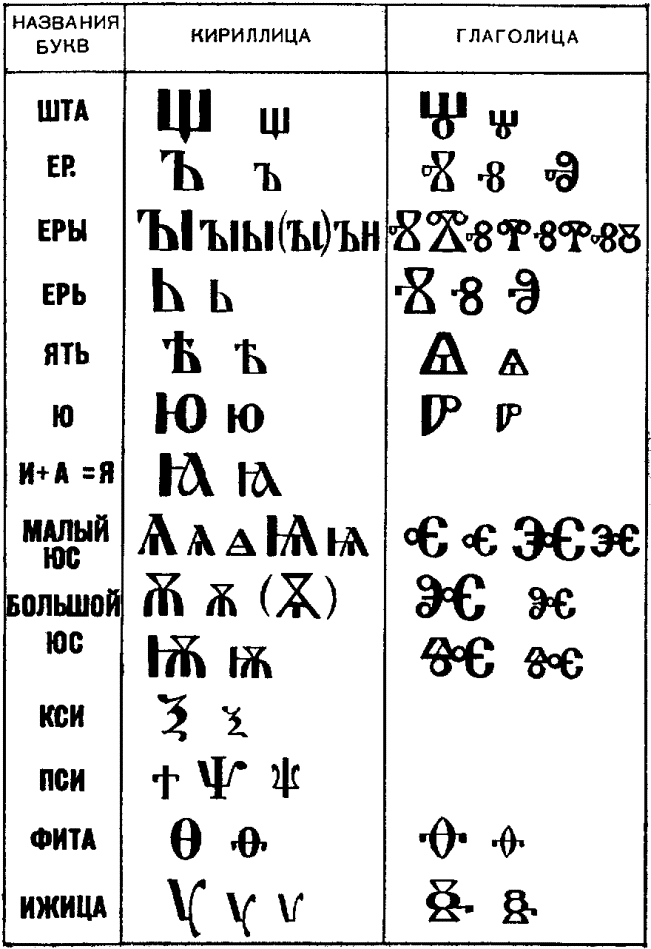
Up to now, not one Slavonic alphabet has reached, but two: the Glagolitic and the Cyrillic alphabet. Both existed in the IX-X centuries. In them, for the transmission of sounds reflecting the peculiarities of the Slavic language, special signs were introduced, and not combinations of two or three basic ones, as practiced in the alphabets of Western European peoples. Glagolitic and Cyrillic letters almost coincide in letters. The order of letters is also almost the same.
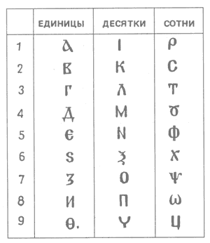
As in the very first such alphabet - Phoenician, and then in Greek, Slavic letters also gave names. And they are the same in Glagolitic and Cyrillic. The first two letters of the alphabet were, as we know, the name - "ABC". Literally this is the same as the Greek "alphabet", that is, the "alphabet".
The third letter is "B" - lead (from "to know", "to know"). It seems that the author chose the names for letters in the alphabet with the meaning: if you read the first three letters of "az-buki-vedi" successively, it turns out: "I know the letters". In both alphabets, the letters were assigned numerical values.
The letters in Glagolitic and Cyrillic have a completely different form. Cyrillic letters are geometrically simple and convenient for writing. 24 letters of this alphabet are borrowed from the Byzantine charter letter. To them were added the letters that convey the sound features of the Slavic speech. The added letters were constructed so that the general style of the alphabet was maintained. For the Russian language it was Cyrillic, many times transformed and now settled in accordance with the requirements of our time. The oldest record, made in Cyrillic, was found on Russian monuments dating back to the 10th century.
But the letters of Glagolitic are incredibly intricate, with curls and loops. The ancient texts written in the Glagolitic alphabet are larger in the western and southern Slavs. Strangely enough, sometimes both of them were used on the same monument. On the ruins of the Simeon church in Preslav (Bulgaria) there was an inscription dating back to around 893. In it, the upper line is made Glagolitic, and the two lower - Cyrillic. The question is inevitable: which of the two alphabets did Constantine create? Unfortunately, it was not possible to answer it finally.


1. Glagolitic (X-XI centuries)

About the oldest form of the Glagolitic we can only judge roughly, because the Glagolitic monuments that survived to us are not older than the end of the 10th century. Peering into Glagolitic, we notice that the forms of its letters are very intricate. Signs are often built of two parts, arranged as if on each other. This phenomenon is also seen in the more decorative design of the Cyrillic alphabet. There are almost no simple round forms. They are all connected by straight lines. The modern form corresponds only to single letters (w, y, m, h, e). According to the shape of the letters, there are two types of Glagolitic. In the first of them, the so-called Bulgarian Glagoliticus, the letters are rounded, and in the Croatian, also called the Illyrian or Dalmatian Glagolitic, the shape of the letters is angular. Neither one nor the other kind of Glagolitic has sharply delineated boundaries of distribution. In later development, the Glagolit took many signs from the Cyrillic alphabet. The Glagolitic of the Western Slavs (Czechs, Poles and others) lasted for a relatively short time and was replaced by a Latin letter, while the remaining Slavs later switched to a Cyrillic type letter. But the Glagolitic has not completely disappeared to the present day. So, it was used before the Second World War in the Croats of Italy. Even newspapers printed this typeface.
2. Charter (Cyrillic XI century).

The origin of the Cyrillic alphabet is also not completely clear. There are 43 letters in the Cyrillic alphabet. 24 of them were borrowed from the Byzantine charter letter, the remaining 19 were invented anew, but in graphic design similar to the Byzantine ones. Not all borrowed letters retained the designation of the same sound as in Greek, some received new meanings according to the peculiarities of Slavonic phonetics. Of the Slavic peoples, the Cyrillic alphabet has been preserved for the longest time by the Bulgarians, but at the present time their letter, like the letter of the Serbs, is analogous to the Russian, with the exception of some signs intended to denote phonetic features. The oldest form of Cyrillic is called the charter. A distinctive feature of the charter is sufficient distinctness and straightness of the inscriptions. Most of the letters are angular, of a broad, heavy character. Exceptions are narrow rounded letters with almond-shaped bends (O, C, E, P, etc.), among other letters they seem to be compressed. This letter is characterized by thin lower elongations of some letters (P, Y, 3). We see these extensions in other types of Cyrillic. They appear in the general picture of the letter with light decorative elements. Diacritic signs are not yet known. The letters of the charter are large and stand apart from each other. The old charter does not know the gaps between words.
The charter - the main liturgical font - clear, straight, slender, is the basis of all Slavonic writing. Here are some epithets describing the letter of V.N. Shchepkin: "The Slavic charter, like its source - the byzantine charter, is a slow and solemn letter; it has the aim of beauty, correctness, church splendor ". It is difficult to add anything to such a capacious and poetic definition. The charter letter was formed during the liturgical writing period, when the rewriting of the book was a matter of charity, unhurried, happening mainly behind the monastic walls far from the worldly vanity.
The greatest discovery of the 20th century - the Novgorod birch bark letters testify to the fact that the Cyrillic alphabet was a familiar element of the Russian medieval life and was owned by various sections of the population: from princely boyars and church circles to simple artisans. The surprising property of the Novgorod soil helped preserve birch bark and texts that were not written with ink, but were scratched with a special "writer" - a pointed stem made of bone, metal or wood. Such weapons in large numbers were found earlier in excavations in Kiev, Pskov, Chernigov, Smolensk, Ryazan and many other sites. The well-known researcher BA Rybakov wrote: "An essential difference between Russian culture and the culture of most countries of the East and West is the use of the native language. The Arabic language for many non-Arab countries and the Latin language for a number of countries in Western Europe were alien languages, the monopoly of which led to the fact that the national language of states of that era is almost unknown to us. Russian literary language was used everywhere - in office work, diplomatic correspondence, private letters, in fiction and scientific literature. The unity of the national and state language was a great cultural advantage of Rus before the Slavic and Germanic countries, dominated by the Latin state language. It was impossible to have such a wide literacy, because to be literate meant to know Latin. For Russian citizens of the same people it was enough to know the alphabet in order to express their thoughts in writing at once; This explains the wide use in Russia of writing on birch bark and on "boards" (apparently waxed). "
3. The half-vault (XIV century)

Beginning with the XIV century, a second type of letter develops - a semi-prison, which later replaces the charter. This type of letter is lighter and more rounded than the charter, smaller letters, a lot of superscripts, a whole system of punctuation marks. Letters are more mobile and sweeping than in the charter letter, and with many lower and upper lengthenings. The technique of drawing a wide-pointed pen, strongly manifested in writing by the charter, is noticed much less. The contrast of strokes is smaller, the pen is sharpened sharper. They are used exclusively by goose feathers (formerly they used mainly reed). Under the influence of the stabilized position of the pen, the rhythm of the lines improved. The letter takes on a noticeable slope, each letter seems to help the general rhythmic direction to the right. Notches are rare, the end elements of a series of letters are formed with strokes, equal in thickness to the main ones. The poluustav existed as long as the manuscript book was living. He also served as the basis for the fonts of the first-printed books. The semi-statue was used in the XIV-XVIII centuries along with other types of writing, mainly with cursive and script. It was much easier to write half a song. Feudal fragmentation of the country has caused in the remote areas the development of its language and its style of half-heartedness. The main place in the manuscripts is occupied by the genres of the military narrative and the chronicle genre, reflecting in the best way the events experienced in that era by the Russian people.
The emergence of the half-fast was predetermined mainly by three main tendencies in the development of writing:
The first of these is the emergence of the need for non-liturgical writing, and as a consequence the emergence of scribes working for order and for sale. The process of writing is speeding up and simplifying. The master is more guided by the principle of convenience, not beauty. V.N. Shchepkin describes the semicast as follows: "... is smaller and simpler than the statute and has considerably more cuts; ... it is inclined to the beginning or end of the line, ... straight lines allow some curvature, rounded ones do not represent the right arc." The process of spreading and improving the half-way leads to the fact that gradually, even from liturgical monuments, the charter is replaced by a calligraphic half-way, which is nothing more than a half-written, written more accurately and with fewer abbreviations. The second reason is the need for monasteries in inexpensive manuscripts. Delicately and modestly decorated, as a rule, written on paper, they contained, in the main, ascetic and monastic writings. The third reason is the appearance in this period of voluminous collections, a kind of "encyclopedias about everything." They were quite thick in volume, sometimes sewn and assembled from various notebooks. Chroniclers, chronographs, circuses, polemical writings against the Latins, articles on secular and canon law, neighbor them with notes on geography, astronomy, medicine, zoology, and mathematics. Such collections were written quickly, not very carefully and by different scribes.

Cursive writing (XV-XVII centuries.)

In the 15th century, under the Grand Duke of Moscow, Ivan III, when the unification of the Russian lands ended and the national Russian state was created with a new, autocratic political system, Moscow became not only a political but also a cultural center of the country. Before the regional culture of Moscow begins to acquire the character of the All-Russia. Along with the increasing demands of everyday life, a new, simplified, more convenient style of writing arose. They became cursive. Cursive writing roughly corresponds to the notion of Latin italics. In ancient Greeks cursive writing was widely used at an early stage of writing development, in part it was also found in the south-western Slavs. In Russia, cursive writing as an independent type of writing arose in the 15th century. Cursive letters, partly related to each other, differ from the letters of other types of writing with their light markings. But since the letters were supplied with a variety of all kinds of icons, hooks and additions, it was rather difficult to read the written. Although in the cursive of the fifteenth century the character of the half-heart and the connecting letters of the strokes is still reflected little, but in comparison with the half-letter this letter is more fluent. Cursive letters were largely executed with lengthening. In the beginning, the signs were composed mainly of straight lines, as is typical for the charter and the semi-establishment. In the second half of the 16th century, and especially at the beginning of the 17th century, the semicircular strokes become the main lines of the letter, and in the general picture of the letter we see some elements of Greek italic. In the second half of the 17th century, when many different variants of writing spread, and in the cursive the characteristic features of this time are observed, less ligature and more roundness.

If the semi-vesture in the XV-XVIII centuries was mainly used only in book writing, then cursive penetrates into all areas. It turned out to be one of the most mobile types of Cyrillic letters. In the 17th century cursive writing, distinguished by special calligraphy and grace, turned into an independent type of writing with its inherent features: the roundness of the letters, the smoothness of their outlines, and, most importantly, the ability to further development.
Already at the end of the 17th century such forms of the letters "a, b, c, e, s, u, t, o, c" were formed, which in the future almost did not change.
At the end of the century, the circular outlines of the letters became even more smooth and decorative. The cursive of that time is gradually freed from the elements of the Greek italic and moves away from the forms of the half-heart. In the later period, straight and curved lines acquire balance, and the letters become more symmetrical and rounded. At a time when the semi-charter is transformed into a civil letter, the cursory way of development is done and cursive, so that it can later be called civic cursive. The development of cursive writing in the XVII century predetermined the Petrine reform of the alphabet.
The ligature.
One of the most interesting directions in the decorative use of the Slavic charter is the ligature. By definition, V.N. Shchepkina: "Viscous is the Cyrillic ornamental letter, which aims to link the string into a continuous and uniform ornament. This goal is achieved by various kinds of cuts and embellishments. " The letter writing system was borrowed from the Byzantines by the southern Slavs, but much later than the appearance of the Slavic script, and therefore it does not occur in early monuments. The first, exactly dated monuments of southern Slavic origin date from the first half of the 13th century, and from the Russians by the end of the 14th century. And it is on Russian soil that art of ligature has reached such heyday that it can be rightly considered a unique contribution of Russian art to world culture.
Two factors contributed to this phenomenon:
1. The main technical technique of the ligature is the so-called mast ligation. That is, two vertical lines of two adjacent letters are connected into one. And if there are 24 signs in the Greek alphabet, of which only 12 have masts, which in practice allows no more than 40 double-digit combinations, the Cyrillic alphabet has 26 signs with masts, of which about 450 common combinations were composed.
2. The distribution of the ligature coincided with the period when the weak half-voiced ones began to disappear from the Slavic languages: ь and ь. This led to the contact of a variety of consonants, which were very conveniently combined with mast ligatures.
3. Due to its decorative appeal, the ligature has become ubiquitous. It was decorated with frescoes, icons, bells, metal utensils, used in sewing, on tombstones, etc.


In parallel with the change in the form of the charter letter, another form of the font develops: initial (initial). The borrowed from Byzantium reception of allocation of initial letters of especially important text fragments underwent essential changes at southern Slavs.
The letter - in the handwritten book emphasized the beginning of the chapter, and then the paragraph. By the nature of the decorative shape of the initial letter we can determine the time and style. In the ornamentation of the screensavers and capital letters of Russian manuscripts four main periods differ. The early period (XI-XII century), characterized by the prevalence of the Byzantine style. In the XIII-XIV centuries there is a so-called teratological, or "animal" style, whose ornament consists of figures of monsters, snakes, birds, animals, intertwined with belts, tails and knots. The 15th century is characterized by South Slavic influence, the ornament becomes geometric and consists of circles and grids. Under the influence of the European style of the Renaissance, in the ornamentation of the 16th-17th centuries we see wriggling leaves woven with large buds of flowers. With the strict canon of the charter letter, it was the letter of the letter that enabled the artist to express his imagination, humor, and mystical symbolism. The initial letter in the handwritten book is a must-have decoration of the initial page of the book.
The Slavic manner of drawing initials and screensavers - the teratological style (from the Greek teras - monster and logos - teaching, monstrous style - the version of the animal style, - the image of fantastic and real stylized animals in ornament and decorative items) - originally formed among the Bulgarians in the XII - XIII century, and from the beginning of the XIII century began to move to Russia. "A typical teratological initial is a bird or beast (four-legged) emitting leaves from the mouth and entangled in a weave that comes from the tail (or the bird also from the wing)." In addition to the unusually expressive graphic performance, the initials had a rich color gamut. But polychrome, which is a characteristic feature of the book-written ornament of the fourteenth century, in addition to the artistic one, was also of practical importance. Often the complex construction of a hand-drawn letter with its numerous purely decorative elements obscured the main mark of a written sign. And for his rapid recognition in the text required a color selection. And by the color of the selection you can approximately determine the place of creation of the manuscript. So, Novgorodians preferred a blue background, and Pskov masters - green. Light green background was also used in Moscow, but sometimes with the addition of blue tones.


Another element of decorating a handwritten, and subsequently printed book - a screensaver is nothing more than two teratological initials arranged symmetrically opposite one another, framed by a frame, with woven knots at the corners.


Thus, in the hands of Russian masters the ordinary letters of the Cyrillic alphabet turned into the most diverse elements of decorative decoration, introducing into the books an individual creative spirit and national color. In the XVII century, the half-way, after switching from church books to office work, is transformed into a civil letter, and its italic version - cursive - in civic cursive.
At this time, there are books of sample letters - "Alphabet of the Slavic language ..." (1653), the letters of Karion Istomin (1694-1696) with magnificent samples of letters of various styles: from the luxurious initials to the letters of simple cursive writing. The Russian letter by the beginning of the XVIII century was already very different from the previous types of writing. The reform of the alphabet and font, conducted by Peter I at the beginning of the XVIII century, promoted the spread of literacy and enlightenment. New civil script began to print all secular literature, scientific and government publications. In form, proportions and shape, the civil font was close to the ancient antique. The same proportions of most letters gave the font a calm character. Readability has greatly increased. Forms of letters - B, Y, L, b, YAT, which in height were larger than the rest of the upper, are a characteristic feature of the Petrine font. The Latin forms "S" and "i" began to be used.
In the future, the development process was aimed at improving the alphabet and font. In the middle of the 18th century, the letters "zelo", "ksi", "psi" were abolished, the letter "e" was inserted instead of "i about". There were new font drawings with a great contrast of strokes, the so-called transitional type (typography fonts of the Petersburg Academy of Sciences and Moscow University). The end of the 18th century and the first half of the 19th century were marked by the appearance of typefaces of the classic type (Bodoni, Dido, Selivanovsky, Semyon, Revilion).
Beginning in the 19th century, the graphics of Russian fonts developed in parallel with the Latin ones, absorbing everything new that originated in both written systems. In the field of ordinary writing, Russian letters received the form of Latin calligraphy. Decorated in "spelling" with a pointed pen, the Russian calligraphic letter of the 19th century was a true masterpiece of hand-written art. The letters of calligraphy were significantly differentiated, simplified, they acquired beautiful proportions, a natural rhythmic pattern for the pen. Among the drawing and printing fonts appeared Russian modifications of grotesques (chopped), Egyptian (bruskovyh) and decorative fonts. Along with Latin, the Russian font in the late XIX - early XX century, and experienced a decadent period - the Art Nouveau style.
calligraphic writing of the letters of the Russian alphabet
Lowercase letter a consists of two elements: an oval and an inclined rod with a curvature at the bottom.
We start to write the letter below the top line of the working line. We move upwards to the left a rounded line to the top line of the working line, round down to the bottom line, we lead the letter inclined through the letter beginning point to the top line of the working line. Without taking your hands off, we lead down the second element of the letter - it is an inclined line with a rounding down.
Wrote to the beat: and-one-and-two-and-one.
Right, left, down, right, up; down, right.
capital letterA consists of three elements: an anterior smooth element, an elongated inclined stick with a rounded bottom and a horizontal rod.
We begin to write a letter above the bottom line of the working line. Slightly round to the right, and we lead obliquely up to the middle of the line, lowering the line to ourselves, without taking our hands off, writing the second element of the letter - a straight inclined line with a rounded bottom. The third element is written on the top line of the work line, crossing the first two elements.
Wrote to the beat: times-and-two-and-three.
Left to right, up, deviating to the right; down, right; from left to right.

Lowercase letterb consists of two elements: an oval and an elongated inclined stick bent at the top.
We begin to write the letter b, as well as the lowercase a. Nottearing off the hands from the oval, we write an elongated inclined line up to the middle of the interline line and end with a smooth turn to the right.
Wrote to the beat: and-one-and-two.
Left to right, up, left, down; right, up, deviating to the right; to the right.
capital letterB consists of three elements: an elongated inclined stick with a loop on the left, a right half-shaft and the upper horizontal rod with a left rounding.
We begin to write a letter from the middle of the line. We write a straight inclined line on ourselves. At the bottom line of the working line, round to the left and lead up a narrow loop. Cross the inclined line above the top line of the working line. Lower the semi-oval line down, round to the left, touching the bottom line of the working line. We write the third element from the middle of the line, rounding it to the left, up and leading along the line.
Wrote to the beat: one-and-two-and-three.
From right to left, down; left, up; deviating to the right, down; from left to right.
Lowercase letterat
consists of an elongated inclined stick with a loop at the top and an oval. 
We start to write the letter below the top line of the working line. We lead with an inclination upward, rounding in the middle of the line between the lines to the left. We lead down an elongated inclined, rounding the bottom line of the working line into an oval.
Wrote to the beat: and-one-and-two.
Bottom up, deviating right, left, down; right, up, left.
capital letterAT consists of three elements: an elongated inclined stick with a loop on the left and two right half-ovals.
Begin to write from the middle of the line. We write a straight inclined line on ourselves. At the bottom line of the working line, rounding to the left, we lead up a narrow loop. Not leading up to the middle of the interline line, we cross the inclined line and continue to lead upwards, rounding to the right, we write the upper and lower roundings. The upper rounding is less than the bottom.
Wrote to the beat: one-and-two-and-and-three-and-two.
From top to bottom, left, up, deviating to the right; right, down, deviating to the left; right, down, left
Lowercase letterg
consists of one element: an inclined stick with rounded edges at the top and bottom. 
We start to write below the top line of the working line. Rounding to the right, touching the upper line, we lead the inclined line to the bottom line of the working line, rounding to the right.
Wrote to the beat: and-time.
capital letterD consists of two elements: an elongated inclined rod with a rounding down to the left and an upper horizontal rod with a left rounding.
We begin to write a straight inclined line on ourselves from the middle of the line spacing. Touching the bottom line of the working line, round to the left. The second element covers the first one. We write from the middle of the line, rounding it to the left, up and leading along the line.
Wrote to the beat: one-and-two.
Right to left, down, left; from left to right.

Lowercase letterd consists of two elements: an oval and an elongated inclined stick with a loop at the bottom.
Begin to write an oval, like a small letter a. Without lifting your hands, we lead down an elongated inclined line to the middle of the line. Rounding to the left, we loop upward, crossing the lower line of the working line.
Wrote to the beat: and-one-and-two and.
From left to right, down, right, up, deviating to the right; down, left, up, deviating to the right.
capital letterD consists of three elements: an elongated inclined stick, a recumbent loop and a right large half-oval.
Begin to write an elongated slant line from the middle of the line spacing. At the bottom left, we write a small loop. Touching the bottom line of the working line, rounding up, we write the right large semi-oval.
Wrote to the beat: one-and-two-and-three.
Top down, left, right, up, left, down .
Lowercase lettere
is a loop. 
We start to write from the middle of the working line. Writing to the right, rounding to the left near the top line of the working line and leading a semi-oval down to the bottom line of the working line, rounding to the right.
Wrote to the beat: and-time.
Bottom up, deviating to the right; left, down, right.
capital letterE consists of two left half-ovals.
From the middle of the line spacing we write the upper lower semi-oval, ending above the top line of the working line. Without rounding it up, with a continuous movement to the left and down, we write a large lower half-oval, touching the bottom line of the working line.
Wrote to the beat: and-one-and-two and.
From right to left, down, deviating to the right; left, down, right .
Lowercase letterё
is written in the same way as the lowercase letter e, just above the letter we put two points. 
Wrote to the beat: and-one-and-two-three.
Bottom up, deviating to the right; left, down, right . Above the letter we put two points.
capital letterE is written in the same way as the capital letter E, just above the letter we put two points.
Wrote to the beat: and-one-and-two-three-four.
From right to left, down, deviating to the right; left, down, right. Above the letter we put two points
Lowercase letterf
consists of three elements. Two elements - left and right semi-ovals. The third element consists of three short straight rods. 
We start to write below the top line of the working line. Rounding to the right, we write the left half-oval. Near the bottom line of the working line, round to the left. Do not tear off your hands, go back to the written and lead the connecting stroke up. Without taking your hands off, we lead the inclined line downwards, we write the connecting line and the right half-shaft.
Wrote to the beat: and-once-and-and-two-and-three-and.
Left to right down, left; right, up, deviating to the right; down, up, deviating to the right; up to the right; left, down, right.
capital letterF consists of the same three elements.
Begin to write from the middle of the line, round to the right, write a half-oval. Near the bottom line of the working line, round to the left. Without taking your hands off, go back and write the connecting stroke up to the middle of the line. Without taking your hands off, we lead the inclined line downwards, we write the connecting line and the right half-shaft.
Wrote to the beat: and-once-and-and-two-and-three-and.
Left to right, down, left; right, up, deviating to the right; down, up, deviating right, right; left, down, right.
Lowercase letterz
in its composition has a right half-oval and a lower loop. 
We start to write below the top line of the working line. We keep a big inclination on the rounding at the top line of the working line, rounding it to the left and, without leading to the bottom line of the working line, we write a rounded loop that extends beyond the bottom line of the working line.
Wrote to the beat: and-one-and-two and.
From left to right, down, leaning to the left; right, down, left, up, deviating to the right.
capital letterЗ consists of two right semi-ovals.
Begin to write from the middle of the line. Rounding to the right, we write the upper half-oval. Not leading up to the top line of the working line, we start far to the left and begin to write the bottom half-oval, more than the upper one.
Wrote to the beat: and-one-and-two-and-one.
From left to right, down, leaning to the left; right, down, left.
Lowercase letterand
consists of two straight rods with curvatures at the bottom. 
We write down from the top line of the working line. Near the bottom line of the working line, round to the right and lead the inclined straight up to the top line of the working line. Without taking your hands off, we write the inclined straight down, rounding it to the right.
Wrote to the beat: once-and-two-and-a-half.
From top to bottom, to the right, upwards, to the right; down, right.
capital letterAND
The first element is written from the middle of the line spacing. We lead, rounding, from left to right upwards. Write an inclined line down to the bottom line, round to the right and lead the inclined straight up to the middle of the line spacing. Without taking your hands off, we write an inclined line down to the bottom line of the working line, rounding it to the right.
Wrote to the beat: and-one-and-two-and-three.
Lowercase letterth
consists of three elements: two inclined rods, rounded below, and a short curved line. 
Lowercase letter this written in the same way as the lowercase letter, and just above the letter we write the third element - a short curved line moving to the right.
Wrote to the beat: one-and-two-and-three.
From top to bottom, to the right, upwards, to the right; down, right, right.
capital letterY it also consists of three elements. It is written just like the capital letter AND, only above the letter is written the third element, as in the lowercase d.
Wrote to the beat: and-one-and-two-and-three-and-one.
From left to right, down, right, up, deviating to the right; down, right, right.

Lowercase letterto consists of three elements: a straight line and two curves.
From the top line of the working line we write the inclined straight down. Without taking your hands off, we lead up the written line, reaching the middle of the line, smoothly rounded to the right, bring it to the top line of the working line, slightly rounded. Without taking your hands off, we return according to the written text, we drop the line of repetition below the middle of the line. To the right we prescribe the rounding and lower the straight line, rounding it to the right.
Wrote to the beat: one-and-two-and-three-and-one.
Top down, up, up, deviating right, right; left, down, deviating to the left; right, down, right.
capital letterTO consists of four elements: an acute element, an elongated straight line with a left loop and two curves.
We start writing from the middle of the line between the lines a short straight line to the right upwards. Without taking your hands off, we lead an elongated straight line down, round off the bottom line of the working line upwards and write a narrow loop, crossing the elongated line above the top line of the working line. We lead to the right upwards, we finish with a small rounding and, without taking our hands off, we return on the written, to the right we register a rounding and we lower the straight line, rounding to the right.
Wrote to the beat: and-one-and-and-two-and-and-three-and.
Bottom up, deviating to the right; down, left, up, deviating right, right; left, down, deviating to the left; right, down, right.

In the composition lower casel the front smooth element and the inclined rod with the rounding at the bottom are distinguished.
We start to write above the bottom line of the working line. Rounding, touching the bottom line of the working line, we draw the line up, tilting it to the right up to the top line of the working line. Without taking your hands off, lead the inclined line down to the bottom line, rounding to the right.
Wrote to the beat: once-and-two-and-a-half.
capital letterL is similar to the lowercase composition of elements and spelling.
We start to write above the bottom line of the working line. Rounding, touching the bottom line of the working line, we draw the line up, tilting it to the right to the middle of the line spacing. Without lifting your hands, we lead the inclined line down to the bottom line of the working line, rounding to the right.
Wrote to the beat: once-and-two-and-a-half.
Left to right, up, deviating to the right; down, right.
Lowercase letterm
consists of three elements: an anterior smooth and two inclined rods with roundings at the bottom. 
Begin to write as a lowercase letter, above the bottom line of the work line. Rounding, touching the bottom line of the working line, we draw the line up, tilting it to the right up to the top line of the working line. Without lifting your hands, we lead the inclined line down to the bottom line of the working line and up to the top line of the working line. Without lifting your hands, we lead down to the bottom line, rounding to the right.
Wrote to the beat: one-and-two-and-three-and-one.
Part capital lettersM includes the same elements, of which the lowercase letter m, only of a larger size.
Begin to write the capital letter, as well as the lowercase letter. Write above the bottom line of the working line. Rounding, touching the bottom line of the working line, we draw the line up, tilting it to the right to the middle of the line spacing. Without lifting your hands, we lead the inclined line down to the bottom line of the working line and up to the middle of the line. Without lifting your hands, we lead down to the bottom line of the working line, rounding to the right.
Wrote to the beat: one-and-two-and-three-and-one.
Left to right, up, deviating to the right; down, right, up, deviating to the right; down, right.
Lowercase lettermr.
consists of three elements: a straight inclined stick, a horizontal stick and an inclined stick with a rounding down. 
Write down the inclined line from the top line of the working line. We return by writing up to the middle. We lead a smooth line to the right, bending downwards, to the top line of the working line. Without taking your hands off, we lead an inclined line down, rounding to the right.
Wrote to the beat: once-and-two-and-a-half.
Top down, up, right, up; down, right.
capital letterH consists of an acute element, an elongated inclined stick with a loop at the bottom to the left and an elongated inclined stick with a loop at the top and a rounding.
We start writing a short line from the middle of the line. Without taking your hands off, we lead an elongated straight line down, round off at the bottom line upwards and write a narrow loop, crossing an elongated line above the top line of the working line. We lead a smooth line to the right, continue upwards to the middle of the line, round to the left and smoothly lower the oblique downward, rounding to the right.
Wrote to the beat: and-one-and-and-two-and-one.
Bottom up, deviating to the right; down, left, up, deviating to the right; up, left, down, right.
Lowercase letterabout
- one element is an oval. 
We start to write below the top line of the working line. Rounding to the left, touching the upper line, continue to round left down to the bottom line of the working line and lead to the beginning of writing the letter.
Wrote to the beat: and-time.
capital letterABOUT - one element is an oval.
Begin to write from the middle of the line. Rounding to the left, we lead down to the bottom line of the working line, round to the right and lead to the beginning of writing the letter.
Wrote to the beat: and-time.
Right to left, down, right, up.
Lowercase letterp
consists of two elements: the first - a straight stick, the second - a straight line with rounded edges at the top and bottom. 
Begin to write a slant straight down from the top line of the working line. Do not tear off your hands, we lead up the written. From the middle upwards, smoothly rounding to the right, we write an inclined straight line, rounding to the right.
Wrote to the beat: once-and-two-and-a-half.
From top to bottom, upwards; up, deviating to the right; right, down, right.
capital letterP in its composition has three straight lines with rounded edges.
Write an inclined line down from the middle of the line, rounding to the left. Write an inclined line down from the middle of the line, rounding it to the right. The third element covers the first and second. We write from the middle of the line, rounding it to the left, up and leading along the line.
Wrote to the beat: times-and-two-and-and-three.
From top to bottom, to the left; from top to bottom, to the right; up, right.
Lowercase letterr
in its composition has two elements. The first is an oblique elongated stick, the second is an inclined stick, rounded at the bottom and at the top. 
Begin by writing from the top line of the work line an elongated slant straight down to the middle of the line spacing. Go back to the middle of the work line, bend right to the top line of the working line, write the rounding to the right and lead the inclined straight down, rounding to the right.
Wrote to the beat: once-and-two-and-a-half.
Top down; up, up, deviating right, right, down, right.
capital letterR has two elements. The first is an elongated inclined stick with a rounding down to the left, the second is the upper half-oval.
Write an inclined line down from the middle of the line, rounding to the left. From the middle of the interline, round up to the right and continue straight along the line, rounding into the right half-oval.
Wrote to the beat: one-and-two-and-a-half.
Right to left, down, left; down, up, right, down.
Lowercase letterfrom
- The left half-oval. 
We start to write below the top line of the working line. Rounding up and to the left, we lead down to the bottom line of the working line, rounding to the right.
Wrote to the beat: and-time.
Right to left, down, right.
The form capital lettersFROM like a lowercase form. This is the left half-oval.
Begin to write from the middle of the line. Rounding up and to the left, we lead down to the bottom line of the working line, rounding to the right.
Wrote to the beat: and-time. Right to left, down, right.
Lowercase lettert
consists of three elements. The first is a straight inclined stick. The second one is straight, rounded at the top. The third element is straight, rounded at the top and bottom. 
Begin to write a slant straight down from the top line of the working line. Do not tear off your hands, we lead up the written. From the middle upwards, smoothly rounding to the right, we write an inclined straight line. Do not tear off your hands, we lead up the written. From the middle upwards, smoothly rounding to the right, we write an inclined straight line, rounding to the right.
Wrote to the beat: one-and-two-and-three-and-one.
From top to bottom, upwards; Up, deviating to the right, down; up, up, deviating to the right; down, right.
capital letterT consists of four elements. One of them is a straight line, three are straight with curvatures.
Begin to write from the middle of the line. We lead down the inclined line to the bottom line of the working line, rounding to the left. Write an inclined line down to the bottom line of the working line. We lead an inclined line downwards, rounding to the right. The fourth element covers the three previous ones. Write from the middle of the interline line, rounding left, up and leading along the line between lines.
Wrote to the beat: one-two-three-and-four.
From top to bottom, to the left; top down; from top to bottom to the right; from left to right.

Lowercase letterthe has two elements: an inclined rod with a rounding at the bottom and a lower loop.
We start writing from the top line of the working line down. We lead the inclined line, rounding to the right at the bottom line of the working line and continue up to the top line of the working line. Without taking your hands off, we lead an elongated straight line to the middle of the line. Rounding to the left, we write a loop, crossing the lower line of the working line.
Wrote to the beat: once-and-two-and-a-half.
From top to bottom, to the right, upwards, to the right; down, left, up, deviating to the right.
capital letterHave consists of two elements: straight lines with rounded edges. We begin to write from the middle of the line between lines. We go rounding, from left to right upwards. Write an inclined line down, touching the top line of the working line. Rounding to the right, we lead up to the middle of the line. We return on the written, write the oblique line to the bottom line of the working line, rounding to the left.
Wrote to the beat: and-one-and-two-and-one.
From left to right, down, right, up, deviating to the right; down, left.

Lowercase letterf is an elongated inclined stick with two ovals.
Begin to write an oval, like a small letter a. Without lifting your hands, we lead down an elongated inclined line to the middle of the line. We return on the written, write the right oval, touching the second element.
Wrote to the beat: and-one-and-two-and-three-and-one.
From right to left, down; up, down, up; left to right, down, left.
capital letterF consists of three elements: two ovals and an elongated inclined rod with a rounding down to the left.
Begin to write from the middle of the line. Write the left oval, touching the top line of the working line. Rounding to the right, we write the right oval, touching the left oval. Do not tear off your hands, we lead straight up to the middle of the interline line. We return on the written, write the inclined straight down, rounding to the left. 
Wrote to the beat: and-one-and-two-and-and-three-and.
Lowercase letterx
Begin to write a letter from the left half-oval. Below the top line of the working line, rounding to the right, we write the left half-oval. Without taking your hands off, we return from the written. Departing to the right, writing, the right half-oval, touching the left half-oval.
Wrote to the beat: and-one-and-and-two-and-one.
capital letterX has two poluovala: left and right.
From the middle of the line, rounding to the right, we write the left half-oval. Without taking your hands off, we return from the written. Departing to the right, we write the right half-oval, touching the left half-oval.
Wrote to the beat: and-one-and-and-two-and-one.
Left to right, down, left; right, up, right; left, down, right.

Lowercase lettercentners consists of three elements. The first two are inclined sticks with curvatures at the bottom, the third is a small loop.
We write down from the top line of the working line. Near the bottom line of the working line, round to the right and lead the inclined straight up to the top line of the working line. Without taking your hands off, we write the inclined straight down, rounding it to the right. We lead down a straight line, rounding to the left, we cross the bottom line of the working line.
Wrote to the beat: one-and-two-and-three-and-one.
From top to bottom, to the right, upwards, to the right; down, right; down, left, up, deviating to the right.
Capital letterC write from the middle of the line. We lead, rounding, from left to right upwards. Write an inclined line down to the bottom line of the working line, round to the right and lead the inclined line up to the middle of the line. Without taking your hands off, we write an inclined line down to the bottom line of the working line, rounding it to the right. We lead down a straight line, rounding to the left, we cross the bottom line of the working line.
Wrote to the beat: and-one-and-two-and-three-and-one.
From left to right, down, right, up, deviating to the right; down, right; down, left, up, deviating to the right.
Lowercase letterh
consists of two elements: a curly line and an inclined rod, rounded down. 
Below the top line of the working line, write the inclined line up. We write a curved line to the right. Without taking his hands off, we write down the inclined straight line, rounding to the right.
Wrote to the beat: and-and-once.
Bottom up, deviating to the right; right, down, right.
capital letterH has two elements. One of them is an inclined stick with rounded edges at the top and bottom, the second is an elongated straight line, rounded down.
Begin to write from the middle of the line. We lead, rounding, from left to right upwards. Write an inclined line down, touching the top line of the working line. Rounding to the right, we move upwards to the middle of the line. Return to the written, write oblique line to the bottom line of the working line, rounding to the right.
Wrote to the beat: and-one-and-two-and-one.
From left to right, down, right, up, deviating to the right; down, right.

Lowercase letterw consists of three elements. These are three inclined sticks, rounded at the bottom.
We write down from the top line of the working line. Near the bottom line of the working line, round to the right and lead the inclined straight up to the top line of the working line. Without taking your hands off, we write the inclined straight down. Near the bottom line of the working line, round to the right and lead the inclined straight up to the top line of the working line. Without taking your hands off, we write the inclined straight down, rounding to the right.
Wrote to the beat: one-and-two-and-three-and-one.
From top to bottom, to the right, upwards, to the right; down, right, up, deviating to the right; down, right.
capital letterW consists of four elements.
The first element is written from the middle of the line spacing. We lead, rounding, from left to right upwards. Write an inclined line down to the bottom line of the working line, round to the right and lead the inclined line up to the middle of the line. Without lifting your hands, we write the inclined line down to the bottom line of the working line. We lead the inclined line up to the middle of the line. Without taking your hands off, we write an inclined line down to the bottom line of the working line, rounding it to the right.
Wrote to the beat: and-one-and-two-and-three-and-one.
From left to right, down, right, up, deviating to the right; down, right, up, deviating to the right; down, right.
Lowercase letterni
in form it resembles a small w, but only has a small loop. 
We write down from the top line of the working line. Near the bottom line of the working line, round to the right and lead the inclined straight up to the top line of the working line. Without taking your hands off, we write the inclined straight down. Near the bottom line of the working line, round to the right and lead the inclined straight up to the top line of the working line. Without taking your hands off, we write the inclined straight down, rounding to the right. We lead down a straight line, rounding to the left, we cross the bottom line of the working line.
Wrote to the beat: one-and-two-and-three-and-four.
From top to bottom, to the right, upwards, to the right; down, right, up, deviating to the right; down, right; down, left, up, deviating to the right.
Capital letterЩ write from the middle of the line. We lead, rounding, from left to right upwards. Write an inclined line down to the bottom line of the working line, round to the right and lead the inclined line up to the middle of the line. Without lifting your hands, we write the inclined line down to the bottom line of the working line. We lead the inclined line up to the middle of the line. Without taking your hands off, we write an inclined line down to the bottom line of the working line, rounding it to the right. We lead down a straight line, rounding to the left, we cross the bottom line of the working line.
Wrote to the beat: and-one-and-two-and-three-and-four.
From left to right, down, right, up, deviating to the right; down, right, up, deviating to the right; down, right; down, left, up, deviating to the right.
Solid signb
consists of two elements: a curly line and a letter b. 
Below the top line of the working line, write the inclined line up. We write a curved line to the right. We lead an inclined line downwards, rounding to the right. We rise upwards and closer to the middle of the working line we round to the left.
Wrote to the beat: and-one-and-two.
Bottom up, deviating to the right; right, down, right, up, left, down.

Letters consists of three elements: inclined with a rounding, a short inclined stick and an inclined stick with a rounding down.
We start to write from the top line of the working line. We lead the inclined line downwards, at the bottom line rounded to the right, we rise upwards and closer to the middle of the working line we round to the left, without touching the written part. Without lifting your hands, we lead up to the top line of the working line, we write the inclined straight down, rounding to the right.
Wrote to the beat: times-and-two-and-three.
Top down, right, up, left, right, up, deviating to the right; down, right.

Soft signь represents one element.
We start to write from the top line of the working line. We lead an inclined line downwards, rounding to the right. We rise upwards and closer to the middle of the working line we round to the left.
Wrote to the beat: once-and-two.
Top down, right, up, left, down.
Lowercase lettere consists of two elements: the right half-oval and a short straight line.
We begin to write a letter with a half-oval. Below the top line of the working line, rounding to the right, we write a half-oval. The second element is held until the middle of the first, from left to right.
Wrote to the beat: and-one-and-two.
Capital letterE
start writing from the middle of the line. We write upwards, rounding to the right, poluoval. On the top line of the working line to the middle of the first element, we write a horizontal short straight line from left to right. 
Wrote to the beat: and-one-and-two.
Left to right, down, left; to the right.

Lowercase letteryu consists of three elements: two straight lines and an oval.
Write down the inclined line from the top line of the working line. We return by writing up to the middle. We lead a smooth line to the right, bending down. We write an oval.
Wrote to the beat: one-and-two-and-a-half.
Top down, up, right; down, right, up, left, down.
capital letterYU consists of four elements.
We begin to write a short straight line from the middle of the line. Without taking your hands off, we lead an elongated straight line down, round off the bottom line upwards and write a narrow loop that crosses the elongated line above the top line of the working line. We lead a smooth line to the right, down and write an oval.
Wrote to the beat: and-one-and-two-and-three-and-one.
Bottom up, deviating to the right; down, left, right; down, right, up, left, down.

Lowercase letteri consists of three elements: a smooth front oval and two inclined rods with a rounding down.
We start to write above the bottom line of the working line. Rounding, touching the bottom line of the working line, we draw the line up, tilting it to the right. Not leading up to the top line of the working line, rounding to the left, we write a small oval. Without lifting your hands, we lead up to the top line of the working line and lower the inclined straight line, rounding to the right.
Wrote to the beat: one-and-two-and-three-and-one.
Capital letterI mr.we start to write above the bottom line of the working line. Rounding, touching the bottom line of the working line, we draw the line up, tilting it to the right. Not leading up to the middle of the interline line, rounding to the left, we write a small oval, touching the top line of the working line. Without taking your hands off, we lead up to the middle of the line between lines and lower the inclined straight line, rounding to the right.
Wrote to the beat: one-and-two-and-three-and-one.
Left to right, up, left, down, right, up; down, right.
Calligraphy is the art of beautiful and clear writing. Beautifully written by the cave people, depicting on the stone walls and arches of their dwelling ancient animals, the nature that surrounded them, gradually giving the drawings the plot compositions. It was a drawing letter, and such a form was called pictography, the drawing conveyed the whole message. Subsequently, the drawings of ancient people are transformed into symbols that have a certain semantic meaning. Gradually they begin to line up in certain combinations, representing already a sequence of events and characters participating in these events, and acquire a narrative character. This ideography is a symbolic letter. In it, the figure (a hieroglyph) denoted a single word. Thus, writing is born.
"Oh, you, who want to become a master in the letter.
Becoming people pleasant and different,
Arrange the edge of the letter with your residence;
So that the whole world knows you,
You should leave peace and sleep,
And this must be done from the time of youth;
Head about paper, like rubbing rub.
Day and night from this work do not rest.
Refuse your desires,
Turn away from the passion of greed and greed.
Fight also with carnal passions,
Cutting the neck of bad passions,
So that you know what a small holy war is.
What is the appeal to the great.
What you think is impossible for yourself.
This should not offend anyone.
Beware, I told you, do not hurt your soul,
Because from the soul that offends the soul, it turns away.
Make it your constant occupation - contentment and obedience,
Do not be an hour unclean,
Always acknowledge the need to remove
From lies, lust and slander,
Removed from envy and envious people.
Since from envy comes a hundred misfortunes for the body;
Do not have in the habit of wiles and rascalities,
Do not choose bad properties;
Anyone who, from wickedness, wiles and hypocrisy,
Cleared, - became a master in the letter.
Kazi - Ahmed. Treatise on calligraphers and artists
The oldest and easiest way of writing appeared, it is believed, even in the Paleolithic - "a story in pictures", the so-called pictographic letter (from the Latin pictus - drawn and from the Greek grapho - I write). That is, "draw-write" (a pictographic letter, and in our time still used by some American Indians). The letter is, of course, very imperfect, because you can read the story in pictures in different ways. Therefore, not all specialists recognize pictography as a form of writing as the beginning of writing. In addition, for ancient people any such image was animate. So the "story in pictures", on the one hand, inherited these traditions, on the other - demanded a certain abstraction from the image.
Sumerian cuneiform (fourth millennium BC).
The symbolic character of the characters, characteristic of primitive people, loses its connection with the images, and is gradually replaced by hieroglyphics. This is the initial stage of writing. On the clay, the hieroglyphs were depicted as dashes with wedge-like thickenings at the end, hence the name Sumerian cuneiform. Individual sounds corresponded to individual hieroglyphs, and words or simple phrases formed in oral speech.


Often the words were written according to the principle of the puzzles: from the signs, the sound of which was similar to the sound of the word, a word was composed. Sometimes ideographic signs acted as "matres lectionis" ("helpers of reading"): an ideogram with a certain meaning was used next to the syllabic complex to explain the meaning of the word. Cuneiformes counted up to 900 characters. Gradually, the recording system became more complicated and became so uncomfortable that it was superseded by other systems of language recording that had appeared by that time.
Egyptian hieroglyphic writing (fourth millennium BC)
The Egyptian hieroglyphic letter goes back to the 4th millennium BC. The Egyptian alphabet numbered about 600 signs - quite clear images of objects, people, animals. The transfer of visible objects was not difficult, and the actions were transmitted with the help of their characteristic moments. For abstract concepts, figures associated with this word were selected: the south was the lily (the coat of arms of Southern Egypt), the coolness was a vase with flowing water, old age - a hunched person.


In Egypt, cursive forms of writing developed: hieratic (from the Greek hieratikos - priestly) letter, and from it - more simplified, demotic (from the Greek demotikos - folk). In the era of creating a demotic letter, the first schools of secular scribes arose. In the II century BC. The demotic letter began to be replaced by a Greek letter, more cursive and more readable.
Greek capital letter (III century BC)
From the southeastern coast of the Mediterranean, the alphabet spread to areas inhabited by Greeks. This happened, probably, in the XI century BC. mediated by the Phoenicians, who concentrated in their hands most of the commercial and industrial activities of the Mediterranean. Having transferred the Phoenician alphabet, the Greeks converted it according to the requirements of their language.
![]()
The Phoenician alphabet, created in the II millennium BC. E., consisted of 22 consonant letters. Realizing the imperfection of this fixation of speech, the Phoenicians used auxiliary signs to more accurately understand what was written, which indicated which vowel sound should follow one or another consonant letter. However, the text recorded without vowels was not understandable.
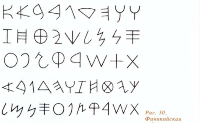
Under the influence of the Egyptian, Assyrian-Babylonian, Crito-Mycenaean systems of writing, the signs of the Phoenician letter were perfected, taking a simple, convenient form.
In the Middle East, under the influence of the Phoenician letter, an Aramaic letter arose that gave rise to all the Eastern alphabets. The Phoenician alphabet in its primary form was perceived in Asia Minor, Greece and Italy. The Greek letter that originated on its basis became the starting point for the development of all Western alphabets.
The most ancient, extant Greek inscriptions, the scientists date back to the VIII - VII centuries BC. e. Unfortunately, the ancient Greek manuscripts were almost not preserved. But according to the materials collected by archaeologists, by fragments of books, images, one can get an idea of the development and peculiarities of the Greek alphabet. The ancient Greeks considered writing as the gift of heaven. According to one of the ancient Greek legends, the Greek taught the letter to Cadmus, the son of Phoenician King Agenor, who sailed on his high-speed ship to the island of Fehr (Santorini). The Greeks were struck by the art of writing and considered Cadmus a demigod, giving him proper honors. Historical evidence suggests that the Greeks really borrowed the alphabet from the Phoenicians, greatly improving it. At the beginning of the VII century. BC. e. The Greek letter experienced its considerable influence.
So, using the Phoenician alphabet, you can easily read the ancient Greek inscriptions found on the island of Santorini.

The Greeks supplemented the Phoenician alphabet with signs for vowel sounds, geometrized it and simplified it.
![]()
The Phoenician letters, which were opened to the left, were turned to the right. Initially, the Greek letter was left-sided. Then this left-sided direction of the letter changed to the right-hand direction. The so-called bustrophhedonic mode of writing (from the Greek Bustrophedon - turning the bull) was the transitional form, where the first line of the text was written from right to left, the next - from left to right, etc., and the letters were turned "face" to the left and then to the right.

This method of writing was adopted from the method of work of tillers. Arguing approximately like this: the plowman, after passing the first furrow, does not return the bulls empty to the beginning of the field, but turns around and plows in the opposite direction. Under the influence of Greek letters, the direction of writing also changed in Latin script. In the IV century BC, the Greeks pass to the letter from left to right.

Mayuscule and minuscule Roman italics (I-VI centuries)
Latin manuscripts came to our time a little. The oldest monuments are mostly epigraphic (carved into stone). No doubt, the letters written by hand and carved into stone were once the same. But gradually they begin to differ more and more from each other. If the epigraphic letter was striving for monumentality, then the handwritten letter gravitated towards simplicity, roundness of forms and better bonding of letters among themselves, which was determined by the need to write quickly.
In connection with this, the Roman italic script developed, as the most stable opposite of the capital letter. In everyday correspondence, the Romans used waxed plates, on which they wrote with a sharpened stick - stilus (hence the style). With a quick letter on such material, some elements of the letters were skipped, for a better linking of the letters a smooth stroke was added, some letters merged together, another letter was written larger than the others, and the entire letter acquired an oblique position.
Italics are divided into early and late. The early, or majuscular italic (majuscula - capital letter), which was used in the 1st-6th centuries, is a letter in capital letters, there are still few connecting elements between the letters.

In a minuscule italic letter (minuscula - lowercase letter), developed by the IV century, the form of letters acquired a distinctly different from the majuscular character.

Roman Capital Letter (1st-5th centuries)
In the VIII century BC. e. Middle Italy - the land between the rivers Tiber and Arno, inhabited the Etruscan tribes of unknown origin, with the language not yet deciphered. Militant Etruscans conquered neighboring tribes and adopted their culture. For the letter of the Etruscans, the Western Greek alphabet was first used, and in the last quarter of the 7th century they already had their own alphabet consisting of 21 (26) signs. By the shape of the letters of the Etruscan alphabet were similar to the letters of the Phoenician-Greek alphabet, the letter was sent from right to left. Apparently, a Latin letter developed from the Etruscan letter.
The culture created by the Etruscans became the cradle of Roman civilization. The historical merit of Etruscan culture is that it served as a kind of bridge between the Greek and Roman civilizations. In the I century BC. E., when Rome conquered Greece, the culture of the Roman Empire was greatly influenced by the culture of the Greek people. Through the medium of Greek literature, many Greek words passed into the Roman language.
The Latin archaic alphabet had 21 characters. The letters of this alphabet resembled the letters of the Phoenician-Greek alphabet. The Romans wrote from right to left. Change in the direction of the letter occurred at the end of the III century BC. E., the formation of the graph of letters lasted several centuries. In the II century BC. e. there is a stabilization of the Latin letter. Archaic forms of many signs were replaced by more perfect ones. The basic form of the Roman monumental writing was formed. From III to I century BC. e. in the Roman monumental writing new transitional forms are formed, the characteristic feature of which was the appearance of serifs. Distinguish the transitional form with pronounced serifs (II-I centuries BC). In the I c. BC. e. for drawing letters on a stone slab a wide-tool was used, which left thin or thick strokes depending on the angle of the letter. Under the influence of the letter, a classical form of the Roman monumental writing arose with a wide-pointed instrument. A beautiful letter becomes an art. A new profession appears - the font wizard. In the II century in the Roman state there were about 25 public libraries, in which not only books were kept, but public readings of still written books were arranged. Along with the public, the number of private libraries also grew. Roman fonts developed the art of the font. Many works of Greek authors were copied. Rich Roman citizens, lovers of literature, opened businesses for the correspondence and distribution of books. Bookstores were usually opened on the busiest shopping streets. In the workshops for correspondence of books scribes or copyists worked-literate, specially trained calligraphy slaves. The manuscripts were written on papyrus and had the form of scrolls. With the advent of writing material that allows folding (parchment), the book has acquired the form of a code - the material for writing written in a block of sheets.
To better understand the structure of the Roman capital font, it should be seen in unity with the ancient architecture.

A classic example of the Roman capital letter - on the famous column of Trajan in Rome (II century).

In the alternation of its straight and rounded lines the same principle is manifested, which is also seen in Roman buildings. Vertically rising pilasters, between them a semicircular arch, above it a horizontal cornice - the same elements in the transformed form can be traced and in letters.

In addition to the inscriptions on the stone, the capital letter was also used in the letter with a wide-pointed pen. It began to develop especially rapidly after the parchment appeared. The letters of the capital letter, having the specific character of the design of the wide-ended pen, are known as the capitalis quadrata.

For long texts, a wide-pointed pen was not acceptable due to the complexity of writing and low fluency. But, nevertheless, the capital letter was used until about the 10th century, mainly in decorative writing and headlines.
Along with the square capitals, a more fluent and sweeping form of writing, rustic (capitalis rustica, ie peasant simple capital letter), is already quite early in development.

It lasted until the XI century, despite the development of new types of writing. Rustica was already used on papyrus, which is confirmed by findings in Pompeii. Even in the VI century rustic wrote whole books, and later it was used only to perform titles and highlight words. The finest texts of Virgil and other ancient manuscripts, preserved to this day of the manuscript, are mostly written by rusticism, and partly by a square capital letter.
The characteristic features of the rustic are thin vertical strokes, and horizontal strokes were performed with strong pressure. In general, a picture of a compressed, narrow and high letter is obtained. Rustic is often found in texts carved on stone, since on a limited marble surface rustic can accommodate much more text than a capital letter.
Unicine Letter (IV-VIII centuries)
At the end of the first century, under the influence of the East, the style of round arches began to penetrate more and more in Roman architecture. The same principle of rounding began to penetrate more and more into the letter. In the works of the third century, there are attempts to round off the form, borrowed from italic writing, but adapted to a rounded style.

A new style is being developed - an uncritical letter (scriptura uncialis). The uncial letter, fully developed in the fourth century, soon became the dominant book letter, and almost all the literature that had come down to us had been executed by the Uncial. Since it was much easier to write an uncial than a square capital, and it was more than a rosary than rustic, it is considered to be the first letter specially intended for writing with a wide-pointed pen.

In the horizontal horizontal strokes are of little importance, and therefore the letter does not have sharp cuts at the top and bottom. Unsal remained in use until the VIII century, but the unicidal forms, mixed with the forms of capital letters, are found in later times in the titles and initials.
It is necessary to distinguish between old and new. The simplest sign of the old uncial (IV-VI centuries) is the diagonal, approximately 45 degree direction of the pen and the absence of serifs. In the new uncial (VI-VIII centuries), generally, light notch and horizontal direction of the feather are observed. But there are also manuscripts in which the technique of the old and the new uncials is mixed. Less common is an uncial, written obliquely. If in a capital letter the words are not separated from each other, then in an official letter of the 7th century this innovation has already been put into use.
Semiuntsialnoe letter (VI-IX centuries).
Over time, the elements of continuously developing italics began to penetrate more and more. Thus, in the V century, the principle of placing letters in a line within two lines was combined, combining an uncial with a capital letter, and the uncial approached the lower italics. If in the capital letter only a bunch of the letter Q was taken out for the lower line, slightly violating the established regularity of the line, then in italics such "violations" (the extended form of the letter S and others) become ordinary.
The modification of the unicent letter, based on italics, the so-called semi-social letter (scriptura semiuncialis) took over all these innovations, as a result of which it became much easier to write and read such a letter. The upper and lower extensions of some letters (d, h, l, f, p, q) distinctly distinguished the peculiar shapes of these letters among other letters of the string. The development of a semi-social letter marked the transition from capital letters to lowercase letters. It was the first lowercase letter for a wide-pointed pen. In this letter there are already a number of pre-images of the letters of the modern lowercase alphabet (a, d, e, g, h and others). The semi-social letter spreads throughout Western Europe and undergoes various changes in its separate regions.

After the fall of the Roman Empire and the migration of peoples, a number of new states arose in Europe. These states were freed from the political and cultural influence of Rome, and their kinds of writing began to develop freely, which had previously been used very narrowly. As before, the semi-national is rapidly developing. There are new types of Latin letters.
Fonts of the early Middle Ages.
The fragmentation of early medieval Europe led to the emergence of various regional types of writing. They can be divided into four main groups, which are often called national species:
1) Irish-Anglo-Saxon (island), common in Ireland and England;
The Irish-Anglo-Saxon letter borrowed much from the runes (an angular letter distributed among the peoples of Scandinavia, from the ancient Germanic tribes),

And from the Greek capital letter, so the rounded letters were often converted into angular and broken.

2) Merovingian letter - in France;
3) Visigothic - in Spain;
4) Old-Italian - in Italy.
A characteristic feature of the Irish-Anglo-Saxon letter is the presence of fractures and angularity. This letter was out of use in the early Gothic era. The distancing of Ireland isolated the artists from the influence of Roman and Byzantine font art and design of the book, and contributed to the development of original art. In Ireland, the art of processing precious metals, carving wood, bone, and stone was highly developed, and it found its reflection in the richly ornamented book covers of books. The decoration of the Irish-Anglo-Saxon book is distinguished by dark and gloomy tones of black, gold, green and red colors. In the monastic scriptories of France, a Merovingian letter developed, which reached the calligraphic perfection in the 8th century. The letter is characterized by a compressed, high and nodular pattern with elongated remote elements of some letters, which gives it dynamism. Having a decorative look, a letter, however difficult to read. The font was used for writing letters and other documents, widely received in diplomatic correspondence.
In Meroving's letter, a clear, slender and graceful calligraphic form of capital letters is developed. Most often these were contour letters, the middle of which was filled with another paint. The Merovingian book was designed according to a certain design, the pages were richly ornamented with ornaments. Under the influence of the iconography of Byzantine artists in the Merovingian book there are many ornaments that have symbolic meaning (cross, body, stars, pigeon). Ornamental motifs contain strict geometric forms and images of leaves, branches of vines, flowers, birds, fish, animals, etc.

In Spain, the former Roman province, where in the fifth century the state of the Visigoths was founded, a Visigothic letter arose from the Roman italic script, but also italics maintained its rights for a long time. Vestote writing was used in the 8th-11th centuries, and until the 10th century it was wide and fat, and later narrow and angular. It surpasses other kinds of writing with its clarity and readability.
![]()
The Arabs, who conquered Spain in the beginning of the 8th century, introduced their culture and their letter here, founded schools here. The Arabic (Moorish) letter spreading among the population had a strong influence on the character of the Visigothic letter.
Old-Italian writing (IX-XIII centuries).
Old-Italian types of writing developed from the IX century, reached their perfection in the XI century and were in use in the XIII century. The letters were rounded here on the basis of the traditions of the early Roman italics. As the centers of the letter became famous two monasteries: in Southern Italy - the monastery of the Benedictines Monte Cassino and the monastery of Bobbio in Upper Italy. In Old-Italian forms of writing, capital letters were used as capital letters and enlarged lower-case letters.

Quite often the traditions of the art of writing were transferred from one country to another, where interlocutors intertwined so that they could not be separated from each other. This confusion, in all probability, created the ground for the emergence of a universally recognized, unified letter. Such a letter, known under the name of the Carolingian minuscule (after the dynasty of the Carolingians) by the end of the 8th century relatively quickly spread not only throughout the state of the Swiss Francs, but also beyond its borders. The ground for this was prepared by the most significant types of writing that preceded him.


In the most perfect artistic form, the Carolingian minuscule is represented in the IX century. The letter of that time was especially readable, the forms of individual letters, mostly not connected with neighboring ones, were distinguished by the purity of style.
Thus, in the Carolingian minuscule letter, the creation of lowercase letters was completed and attempts were made to create uppercase signs corresponding to them. While instead of them used minuscules in augmented form or letters of capital and unicent letters, and often both interspersed. Only the eleventh century from capital and uncial letters developed an independent form of capital letters, the so-called Lombard Versailles (often called the Gothic majuscules).

Gothic style, texture (XI-XV centuries).

At the end of the 11th century, the nature of the minuscules began to change. The reason for this was the development of a new style - Gothic, which, conquering architecture and plasticity, began to win and the art of writing. The round arch retreats, and its place is lancet, and thus during the entire 12th century a slow but consistent process of the formation of a new style is observed. Broken lines penetrate the letter; rounding and ellipses take the form of pointed almonds.
At the beginning of the 13th century, the Gothic style became dominant almost throughout Europe. The features of the early Gothic writing are the dark general picture of the letter, the conciseness of the letters and the breaking point of their ends. The compression of the letter allows you to fit more text into the line and divide the page into two columns, which once again emphasizes the principle of verticality and the construction of the page. Such a broken Gothic letter, uniting the whole page in a dense fabric, the old masters of the letter called a texture (from the Latin textura - cloth). The text, densely and evenly covering the page, really resembled woven fabric.

Textural minuscules had correct, "measured" distances between vertical strokes, the width inside the letter lumen is approximately equal to the thickness of the stroke. The lowercase "t" with its top goes beyond the upper horizontal line, above the letter "i" for highlighting its stand among others appears a line - a dot. Some other signs began to be written in a different way. In early types of Gothic letters in capital letters were the Lombard Versailles. Later they are preserved only in the form of initials, because over time the Gothic letter develops its special forms of capital letters.

Rotunda, Swabian letter (XV century)
In Italy, a special kind of early Gothic writing develops - the so-called circular letter or rotunda (Italian Rotondo - round, rounded). In its letters, the roundings remain, they are sweeping and swift. Only the upper ends of the racks are broken. The circular letter is broader and more spacious than other types of Gothic writing and is rightly considered now as an intermediate form between gothic and antique. This is one of the few types of Gothic writing, to which it was possible to adapt the muescules of antiquity.
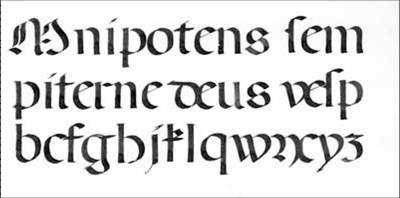
The circular letter is considered one of the most beautiful writing styles of Western Europe of all time. It reached its heyday in the fifteenth century and loses its significance only with the transition from Gothic to Renaissance.
The development of Gothic writing in Southern Europe ended in round-shaped forms, while in Northern Europe it continued for a whole period, called Late Gothic.
Since the demand for cursive writing has not disappeared anywhere, at the end of the 12th century there appears a Gothic italics.

And in the XIV century, as a result of the crossing of the book letter and the writing of italic, a new kind of Gothic font appears - bastard (from the French bâtard - mixed).
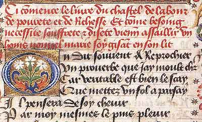
Of the later types of Gothic writing, the eldest was the Swabian letter (or Schwabacher). It is very roomy, like a circular one, and more readable than a texture. Broad proportions give this letter a sweeping character.
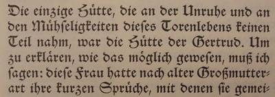
In German-speaking countries, versions of Gothic font were also actively used after the Middle Ages. For example, a masterpiece of office aesthetics of the XVII-XVIII centuries - the Chancellery (from the German Kanzlei - office), which affirmed the beauty of the paper as the highest bureaucratic virtue.
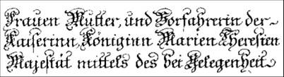
Or a fracture popular in the same XVII-XVIII centuries, whose name comes from the German "Fraktur" - a fracture, a fracture, and is sometimes used as the name of the Gothic font as such.

In the Renaissance, there are huge changes in the economic and socio-political life of European peoples, caused by the birth of bourgeois relations in the depths of feudalism.
The development of cities, the intensification of class contradictions in them, the changes that took place in the world outlook of people, contributed to the creation of a qualitatively new literature based on antiquity, popular literary traditions.
At the end of the thirteenth and the beginning of the fourteenth century, capitalism was born in Italy, the formation of city-states, such as Venice and Florence, was taking place. This process is accompanied by a rapid development of culture. In Italy, the fourteenth century develops book business. Along with the scriptory there are secular institutions of book-writing. A great contribution to the development of secular culture was made by the outstanding humanist of the Italian Renaissance Francesco Petrarca (1304 - 1374). Francesco Petrarca not only collected manuscripts, but he was also a good calligrapher. He is credited with creating a new kind of letter - a humanistic minuscule, which later served as a model for creating many typographic fonts.

Poggio Bracholini (1380-1459), a humanist scholar, translator, archaeologist and bibliographer, also collected ancient Roman inscriptions, ancient manuscripts of Latin authors. In Florence, he founded a school, in which they taught the letter a clear and beautiful Carolingian minuscule. His disciples distributed the letter throughout Italy.
The Renaissance did not manage to put an end to the history of the "barbarous" medieval aesthetics. Moreover, ironically trying to dissociate itself from the gloomy Middle Ages and build a new culture on the basis of pure antique designs, Renaissance calligraphers actually only revived pre-Gothic, but still medieval style of writing. They selflessly copied manuscripts executed by the Carolingian minus, mistaking them for the originals of Greco-Roman antiquity. From this copy was born a new font, named humanistic antiquity (from the Latin antiquus - ancient).

In the business circles of Renaissance Italy, the so-called "trade" letter began to be used - humanistic italics, most of whose letters were executed with a single movement of the pen. It is also based on the Carolingian minuscule.
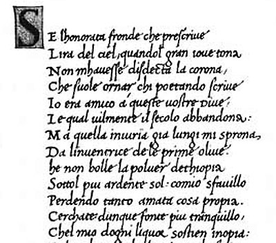
In parallel with the development of the humanistic minuscule, a handwritten letter developed by a thin or ordinary pen developed. Perfect execution of this letter began to be called calligraphy. The term "calligraphy" (from the Greek kallos - beauty and graphos - graphic representation, letter) appeared in Europe in the XVI century simultaneously with humanistic italics. In the 17th century, when the canon of the classical calligraphic writing, which served as the main style until the second half of the 20th century, was meant, this term meant "stylistically flawless execution of a letter with a thin pen."
There are many types of calligraphic writing. The usual calligraphic writing is double-clipping (it has fat basic and thin connecting strokes). In the old days, the art of calligraphy was highly valued. In the old school a lot of attention was paid to teaching calligraphy, since a person who possessed a beautiful handwriting could already work as a clerk. The most common type of calligraphic writing in the XVIII century was English. Created on the basis of his Russian letter is considered one of the most beautiful examples of calligraphic writing. For old samples of the calligraphic letter is characterized by a large slope of letters, for example the slope of the letters of the English letter is 54 °. However, there are variants without inclination (straight lines) and with a left-sided inclination. Together with the art of calligraphy, linear ornamental ornaments developed and spread.

In the 19th and early 20th centuries, a round letter circulated - the rondo, which differs significantly from the humanistic italics and acquires the qualities of a calligraphic letter made with a wide-pointed pen.
![]()
On the basis of hand-written calligraphic samples of the letter typographic calligraphic fonts were created.
So, a master class on calligraphy. I went to him a very long time and finally reached :-)
The company in us there was very nice. Imagine, 10 people and all the same maniacs like myself! 5 hours of talking about letters, explaining to them in love and learning to write hares. I really was in the seventh heaven. How can I adore, when I am taught and carefully monitored that I do everything right! What kind of a thrill. What a pleasure in its pure form that timely efforts are attached to properly applied efforts.
Under the cut, you can see my first scrawl. I must say right away that this is the truth of the scribble, and it is not said so that you will start persuading me in the opposite. I have never before engaged in scientific calligraphy, only artistic amateur performance. Achieve mastery in 5 hours of classes - this would be an anecdote, an honest pioneer. Therefore, the post is just a report, that I began to deal with a relatively new thing for me, that I just liked wildly and that I want more!
This is the workshop where the classes take place. Every time I enjoy German resourcefulness. The old coal-mining mine in Essen was completely redesigned as workshops, exhibition and concert halls. The expanses there are extraordinary and the atmosphere is immediately operational. It's just that all the girls went to a snack, and I calmly, so as not to embarrass anyone, to take pictures on the phone.
This is another part of the same table 
The occupation began with the fact that Ilze Strater distributed to us all the daddies signed by her hand. They had information about the materials, the contents of the MC, examples of writing letters and stuff.
The first step was warm-up. It is necessary and possible to try different materials and try to inscribe something that would NOT be like real letters. It was necessary to practice in abracadabra - to relax the hands and feel the material. First, continuous lines, then practicing in pseudo-Chinese hieroglyphs, that is, in the inscription of something that looks like individual symbols. This is my paper scam and my workplace. 
And then it began! Ilse gave us samples of the humanistic italics, which they wrote in Italy during the Renaissance. And on the leaves were carefully marked and the sequence of applying hooks, and the angle at which you want to put the pen. Do I have to tell you that my hands did not obey at all!
Ilsa showed which feathers for this case are more suitable, how to correctly fill them with ink, where to try and where to start. I sat over each letter so that in the end I did not have time to learn half of the alphabet before the end of my classes. Once again I repeat - this is a trial design. Here I shot and studied elementary pen correctly to keep. Correctly written letters are practically not there - this is a photograph of the very first samples of the pen at the beginning of the lesson.

Not without interest I learned that italics are better to write with a feather Nr.2 - this is with a flat tip 2mm wide. Then the thickness of the letter lines is not regulated by pressing, as in the case of a pointed pen, but due to the very shape of the pen - you can turn a little and get thick and thin lines characteristic of dynamic fonts. It was also important to know that the shape and size of the pen directly affect the height of the string. Mandatory rule: 5 strokes of the pen - the height of the lowercase letter. Therefore, if the pen is 2mm, the height of the line will be 1cm. If at a pen thickness of 2mm to take a smaller line height, then the font will appear greasy and clumsy. Therefore, the larger the pen, the larger the letters should be.
In the dining room there were different examples of work. I saw colored feathers on them, I could not pass by - I love this business. 
Books that advises Ilsa. They could be flipped and photographed. I decided that I would take a photo and just take it to the library to look through it. 
This book Ilze advised to immediately buy - it's with a disk, which contains detailed video lessons of the master with explanations. We even looked a bit at the top of the capital letters right on the lesson. A lesson about the writing of capital letters: the main forms, where necessary, and where you can not crawl by the line, at what angle to put the pen, etc. There is also a notebook for exercises. I immediately ordered both.
If you suddenly read and listen in German, here is the link to the Amazon on this book: Neue Wege zur Kalligraphie: Eine Schrift - 1000 Variationen. Mit DVD and on a notebook for exercises: Übungsheft (Neue Wege zur Kalligraphie) . Ilze says that this is the best book you can think up for beginners.

And it is already at home - spread out its treasures and let's write further. To write while plainly it is impossible, but I at least am glad, that have remembered at the lion's share of the alphabet, in what sequence to put strokes and how to twirl a feather. She brazenly tried to combine the letters in a word and immediately received from Ilse on the cap: "Do not rush, so this font is not connected! This is not a prescription in the first grade of primary school!" Now it's up to the little thing to practice until it turns out. In general, Ilse repeated for the first day of the order of 100 times the phrase: "First learn the base, and show originality will later, when the elementary learn!" And it's like balm - I'm also sure of the correctness of this approach, but I wanted to try something :-) 
Let's see what tomorrow's lessons will bring. The program will work on individual projects. My shocked. What other projects? I just write the beginning and barely remember how the letters to derive, the coordination of movements is almost zero, no correctness. But how much buzz! So I'm already happy for the second day and already now I know what I want in March for the next two-day course. At least to practice by this time to compare with Ilsa result. 
So the sequel follows. I will manage a separate tag "calligraphy" better so that if in the end I start seriously, follow the progress.